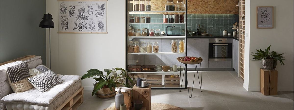
Changing your consumption habits is good. Implementing this philosophy at home is better! In this spirit, we are redesigning the kitchen by opting for sustainable materials, earthenware, tiles, wood and in particular OSB, which immediately gives a natural atmosphere to the room. On the practical side, we reserve a large place for selective sorting, including compost, and we organize the storage of bulk and fresh products so that they are always at hand. The right idea? The large custom shelf backed by a glass wall, on which you can store all the groceries in glass jars … a practical and decorative device that makes the link between the kitchen and living room.
The strong points of ecological cuisine in Kitchen

- Backed by the glass wall, a large custom shelf for storing bulk.
- Standard storage that optimizes the available space, from floor to ceiling.
- Embedded in the work plan, a planter of aromatic plants always at hand.
- Custom OSB facades for tall furniture.
- Three bins for selective sorting with a suitable opening system.
- Concrete effect furniture fronts in harmony with the floor tiles.
- On the living room side, a trendy nature decor that echoes that of the kitchen.
A display shelf
To partition while keeping the maximum of light, we divert a shower screen that we install at the entrance of the kitchen.

A custom-made shelf of the same dimensions is attached to the wall, which allows a large storage space without encroaching on the volume of the kitchen.
The shelf consists of 18cm shelves, a depth sufficient to place all types of jars: containers suitable for storing bulk and which give a grocery look to the kitchen.
In the lower part of the shelf, you can slide wooden crates, ideal for placing fresh vegetables.
The shelf is completed by an original fruit basket, consisting of a pot-holder on which there is a round tray.
Optimized layout
The smaller the surface of the kitchen, the more important it is to use the least square centimeter of it and in particular the portion of the wall running alongside the window.
There is installed a column that occupies the entire height through the use of a cabinet supplemented with boxes. The trick is to choose them shallow (35cm) to make them less bulky.

Above the linear consisting of classic low boxes, high boxes, also shallow, are installed over the entire width of the wall.
If the boxes are standard, the facades are made to measure in OSB. By dressing the crawling ceiling in the same material, the volume is visually enlarged.
Perfectly integrated into the cladding of the high boxes, the hood is ultra-discreet.
For lighting, we favor sobriety, durability, and efficiency, by opting for LED spotlights.
We take advantage of the doubling of the ceiling to embed several so that they generously illuminate the entire volume of the kitchen.
For more targeted lighting of the worktop, strips are fixed under the high boxes of the main shelf.
Discreet and practical storage
Indispensable in an ecological kitchen, selective sorting must be practical and well organized.
The space located in front of the window is arranged to have three trash cans, hidden behind facades and surmounted by a work surface.

For easy access, we adapt the standard kitchen fronts in a tilting opening version, much more practical for daily use.
All concrete effect façades are fitted with integrated handrail handles, both practical and stylish.
Under the sink, we install a specific box in which we place cleaning products, ecological of course!
Side-wall side, we use the small depth (20cm) to make custom storage for tea towels.
Attached to a credenza bar, they are hidden by a classic box front.
We exploit the angle of the kitchen by installing a suitable box equipped with a swivel and extractable storage with two baskets.
The window side column is used to store pots, casseroles, and dishes in height. They are therefore easier to take and store.
A DIY storage wall
On the wall facing the window, two wine racks are installed one on top of the other to occupy all the space from floor to ceiling.
This provides graphic storage for small bottles but also tea towels and rolled towels, and even seasonal fruits and vegetables of small caliber.

Another space-saving idea, the wall converted into a multifunction panel thanks to a painted plywood panel glued to the wall.
Beforehand, it is punctured with holes spaced 20cm in width and height in which we place pins.
We modulate the number and location to hang small utensils and accessories or to have mini-shelves.
The most decorative: we favor wooden accessories and objects, for the contrast with the black background but especially for the harmony with the adjoining locker and the OSB panels.
An indoor mini vegetable patch
When you love to cook, you often need parsley, chives or thyme. Instead of putting messy pots on the worktop, why not put a planter in it?

We use the small unused volume at the back of the bins to cut and place the planter, blocked by its wider edge. Right in front of the window, the aromatic plants benefit from the contribution of light.
A design and nature style
The kitchen is partially open to the living room, we harmonize the colors and materials of the two spaces to create a unity of style.
Matching the facades of the kitchen, the large concrete effect tiles placed everywhere on the floor creates visual continuity and reinforces the mineral atmosphere.

Color of nature par excellence, green is used in glazed earthenware for the splashback of the kitchen and in matching paint on one of the walls of the living room.
Wood provides warmth in the kitchen: OSB boxes and ceiling, burnt wood worktop, bottle racks, cutting boards, and utensils.
In the living room, wood too, with the pallets that constitute the frame of the sofa or the cubes as a coffee table.